Intent.Blazor.Components.MudBlazor
MudBlazor is a modern, open-source UI component library for Blazor that follows Material Design principles, providing a rich set of customizable components for building sleek and responsive web applications. It simplifies Blazor development by offering built-in theming, form validation, and a wide range of ready-to-use components like tables, dialogs, and charts.
This module enables you to realize your UI design using MudBlazor.
For more information on MudBlazor, refer to the official documentation.
Webinar - Blazor Frontend Automation
In this webinar, we'll explore how we can automate and continuously manage these patterns in Blazor & MudBlazor, dramatically accelerating our .NET development!
Sample Application
We also have a technology sample available, which you can download and try out from our GitHub repository here.
The Home Page
This module seeds the modelled Home page with a MudBlazor-styled landing page — a hero section and a three-tile bento grid — together with its scoped Home.razor.css.
This is a once-off seed, not managed output. Both files are written only when they do not already exist, so from the first generation onwards the Home page is yours:
- Your edits to
Home.razorare preserved on every later run. Only the@pageroute and<PageTitle>refresh from the page'sPagestereotype in the User Interface designer. - Markup you design for the Home page in the User Interface designer generates normally.
- To get the default back, delete
Home.razor(orHome.razor.css) and re-run the Software Factory.
Applications with no component library installed get the plain-HTML equivalent from Intent.Blazor instead; this module's version takes over whenever it is installed.
AI Skill Samples
Each bundled AI skill (e.g. mudblazor-dialog-adding-entity) ships a SKILL.md and one or more sample files into your application's .agents/skills/<skill-name>/ folder. The sample files are regenerated on every Software Factory run until the skill's own SKILL.md has been hand-edited — once you customize a skill's instructions, its sample files are left untouched too, on the assumption you have taken over maintenance of the whole skill.
Use Custom Stylesheets
This module ships an additional ux-mudblazor.css stylesheet on top of the token/utility-class theme from Intent.Blazor, linked into App.razor right after ux-components.css.
Intent.Blazor's Use Custom Stylesheets module setting (off by default) also covers this module: when enabled, ux-mudblazor.css is no longer generated and its <link> tag is removed, for applications that supply their own stylesheets instead of building on the default theme system.
Tips for Styling Your MudBlazor Application
Customize Your Site Colors and Fonts
You can set up a custom MudTheme to customize your site's color palette and typography.
In MainLayout.razor
- Add a
Themeattribute to theMudThemeProvider. - Set the
Themeattribute to your backing field for the theme.
@inherits LayoutComponentBase

<!-- Specify the backing field for your theme -->
<MudThemeProvider Theme="_mySiteTheme" />

<MudPopoverProvider />
In MainLayout.razor.cs
- Add a private field
_mySiteThemeof typeMudTheme. - Configure the theme according to your preferences.
- Add an
[IntentMerge]attribute to theMainLayoutclass so that Intent Architect preserves your customizations.
[IntentMerge]
public partial class MainLayout
{
    private MudTheme _mySiteTheme = new MudTheme
    {
        PaletteLight = new PaletteLight
        {
            Primary = "#ADD8E6", // Light Blue
            Secondary = "#1B2550", // Dark Blue
            Background = "#F4F6F9", // Light grayish background
            Surface = "#FFFFFF", // White content area
            AppbarBackground = "#1976D2", // Match primary
            DrawerBackground = "#F4F6F9", // Darker blue for sidebar
            TextPrimary = "#212121",
            TextSecondary = "#757575"
        }
        /*
        You may also want to configure the following properties:
        - PaletteDark
        - Typography
        */
    };
}
Flexible Layouts Using the Layout Stereotype
MudBlazor's layout system is based on CSS flexbox and grid principles, leveraging Bootstrap-style breakpoints to create responsive designs.
A common way to layout components in MudBlazor is by using a MudGrid with MudItems, as shown below:
<MudGrid>
    <MudItem xs="12">
        <MudCard>Item 1</MudCard>
    </MudItem>
    <MudItem xs="12" md="6">
        <MudCard>Item 2</MudCard>
    </MudItem>
    <MudItem xs="12" md="6">
        <MudCard>Item 3</MudCard>
    </MudItem>
</MudGrid>
To achieve this using the User Interface Designer, model it as follows:
- Add three
Cardcomponents. - Apply the
Layoutstereotype to theCardcomponents. - Configure the stereotypes accordingly.
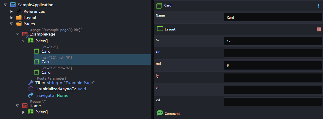
For more details on MudBlazor layouts, refer to the official documentation.